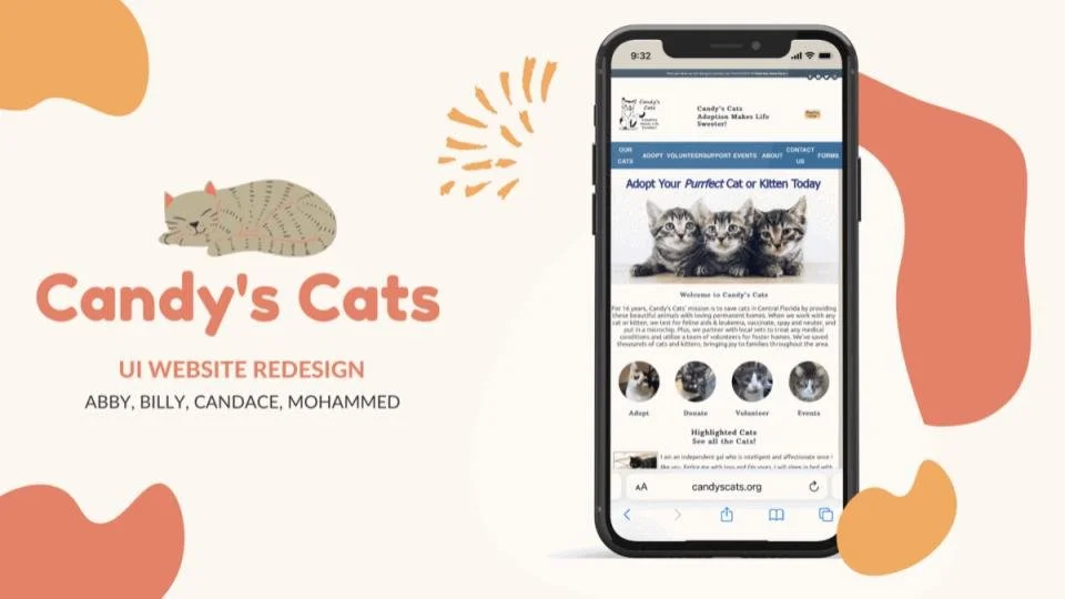
Candy's Cats - Redesign
Project Description: A website redesign prototype for a local nonprofit.
Team Members: Abby G., Candace C., Mohammed Q., Billy Ridore
Tools Used: Figma, Invison, AdobeXD, Miro
Project Overview
Problem Statement: Candy's Cats was created to save cats in Central Florida by connecting them to loving, permanent homes. We have observed that Candy's Cats is not receiving enough donations to grow their organization to take in more cats. How might we improve our website's navigation so that users can easily find where to donate and online donation sales increase?
I worked along side with 3 other individuals with the goal of redesigning the original Candy's Cats website into a more modern, interactive, and serviceable experience that would overall help bring more attention and donations to this organization.
Value Proposition: Our organization, Candy's Cats, is developing a new website to connect our community with rescued cats. Unlike big shelters, we specialize in Central Florida cat rescue and have built a strong local network of vets and volunteers. We vaccinate, spay/neuter, and microchip all cats who come in our care so they're ready for you to take home.
Research
To kick off our research, the team and I crafted a survey and and had varying participants submit their responses. The goal of this survey was to obtain data on people's thoughts, history, and overall feelings when it comes to pet adoptions.
This was a short 7 question survey with majority of the questions being multiple choice.
A key question we had for participants was " How can a pet shelter website make the adoption process easy?" A few standout responses we received were:
- Clear, readable, good photos, and easy forms to fill out.
- Making the website user friendly & being attentive to any inquires.
- Listing out all details/behaviors of pet.

Heuristic Evaluation
Following the survey , a heuristic evaluation was conducted for the Candy's Cat website to evaluate the appearance, content, navigation, and functionality.
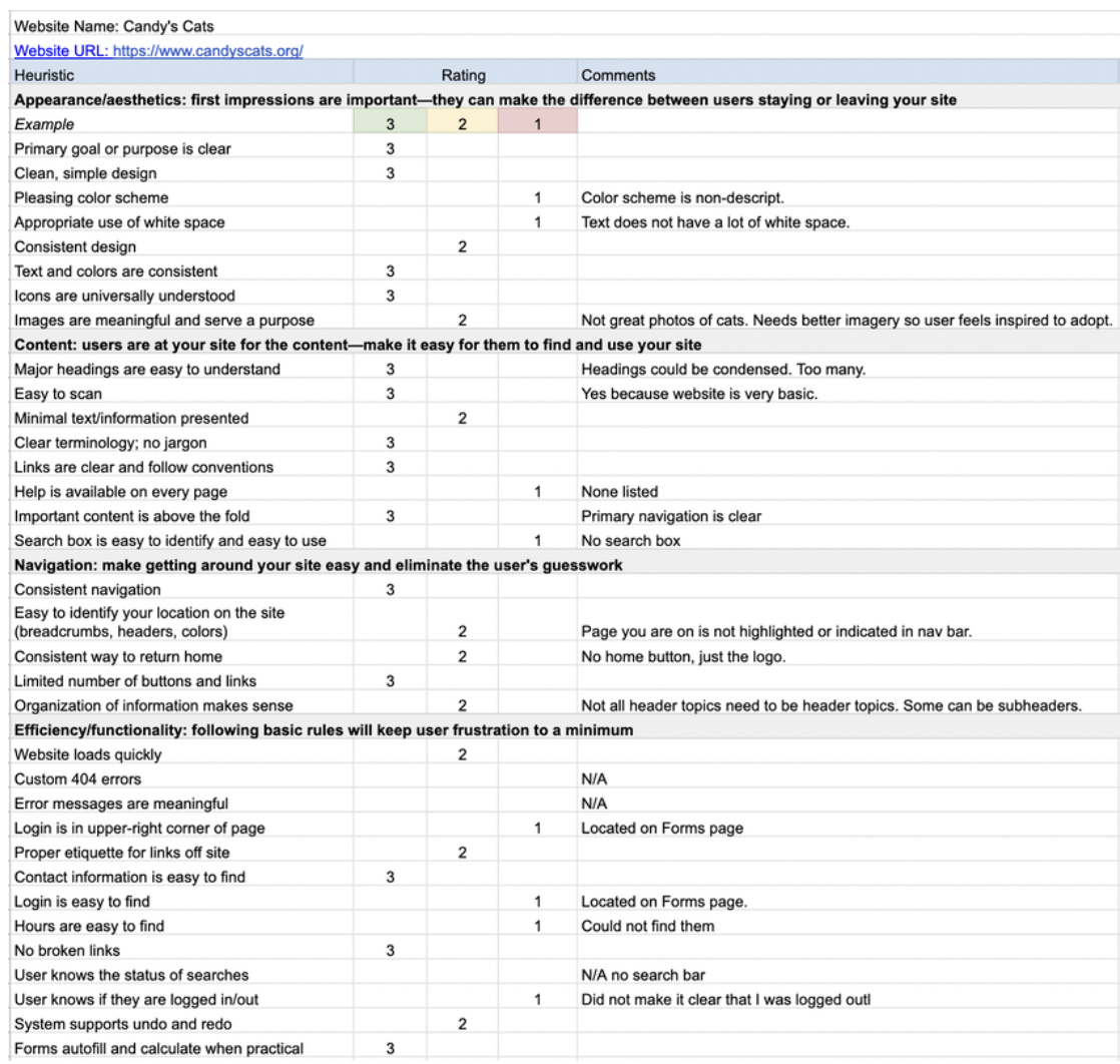
Insights and Takeaways
Primary purpose is clear
Poor use of whitespace
Color scheme is non-descriptive
No search bar found.
Affinity Diagram & Feature Prioritization Matrix
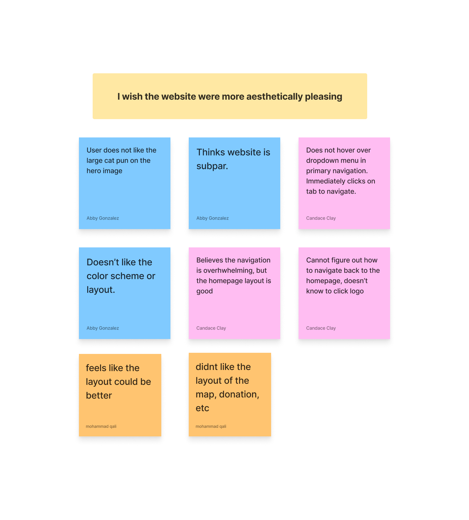
Using the feedback from the interview notes, we created an affinity diagram that allowed us to categorize common responses. We derived 5 key takeaways.
I wish the website were more aesthetically pleasing.
I need a safe and credible way to donate
I need to easily find how to become a volunteer
I wish there were more pictures and less descriptions of the cats.
I want the header categories to be condensed.

We also constructed a feature prioritization matrix choosing to focus on a few low effort / high priority features. These features consists of:
A better display of the cat information.
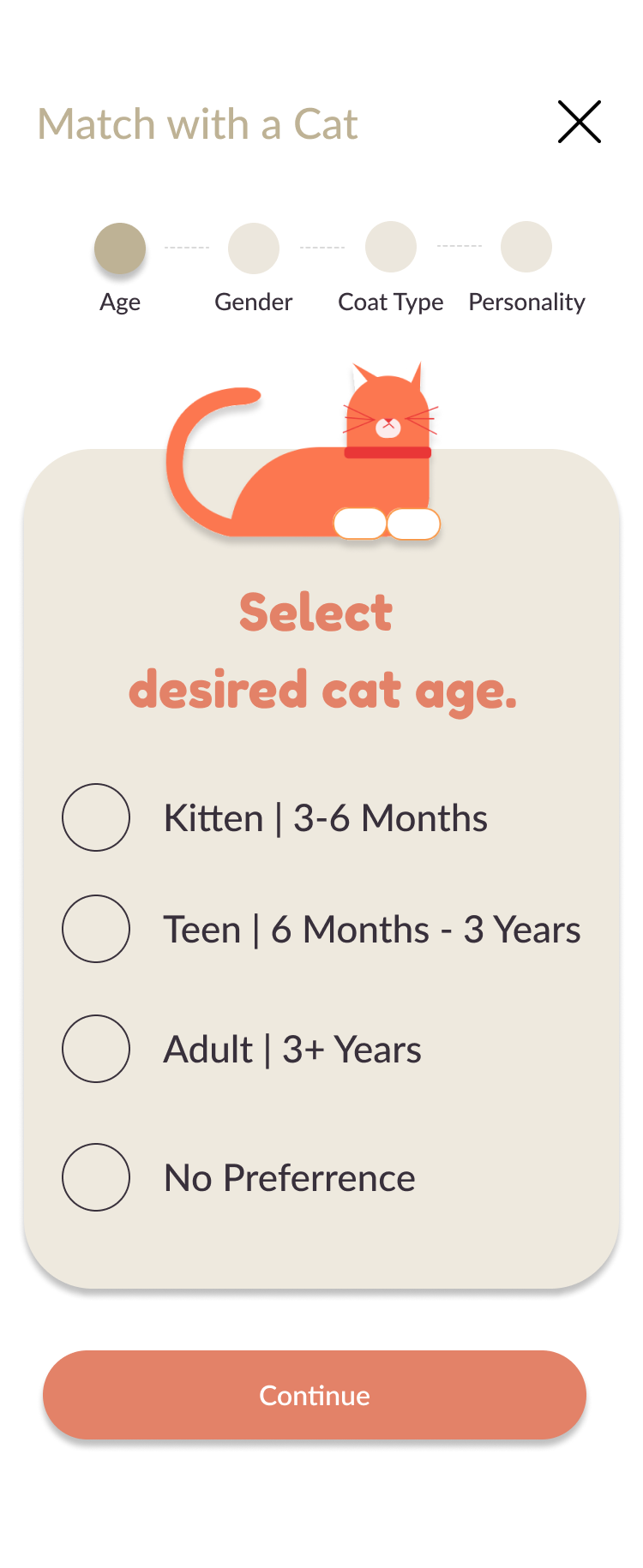
A form to fill out to get matched with cats.
A safe way to donate.
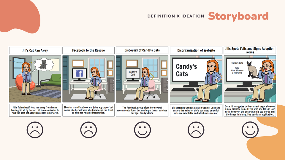
Definition x Ideation

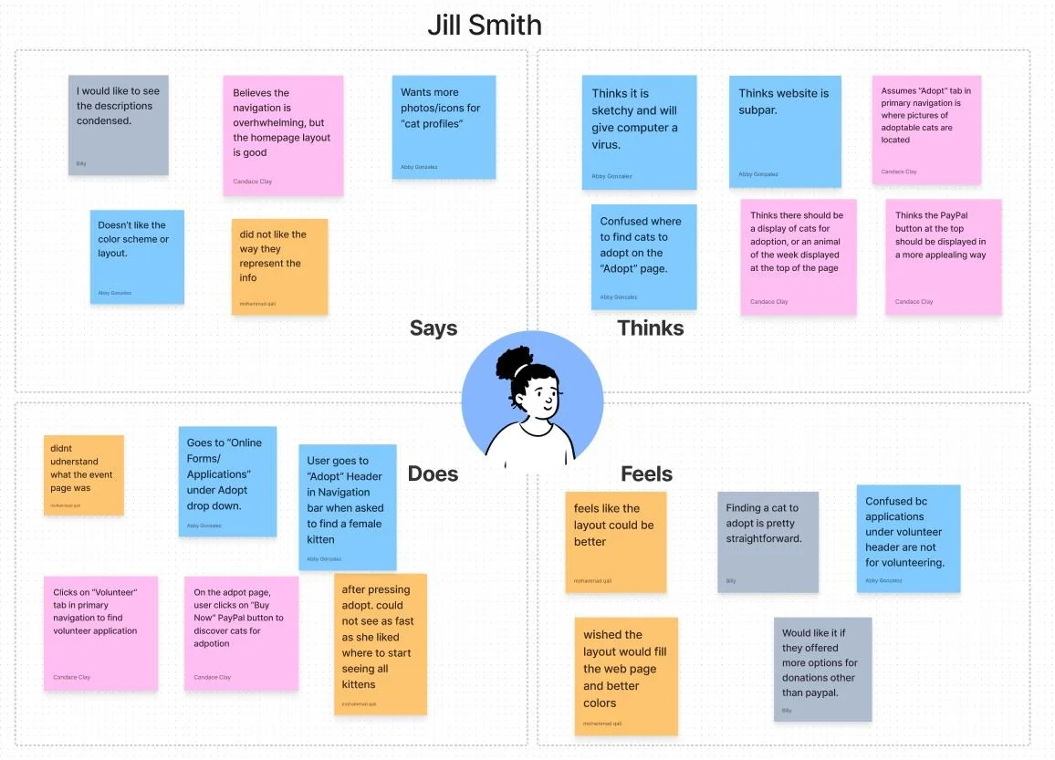
Empathy Map
My team and I then took the information from our affinity diagram and organized it revolving around Jill Smith.
Jill is a cat lover passionate about animal rights, needs an easy way to support cat adoption online so she can get cats into good homes
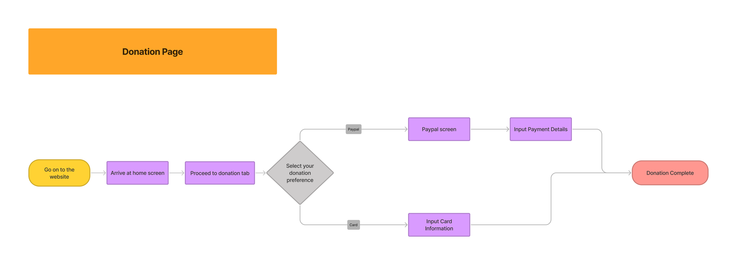
User Flow
From our initial testing, my team and I found that many users found the "donation" section in particular to appear a bit dated. Many users were distrusting of the current process and many did not feel their donations were secure.
My team and I decided to update the current donation process into one that is much quicker, secure, and has a modern look and feel.
Down below is a visual manifestation of a user flow that reflects a new and simplified process that users would complete while donating to Candy's Cats.
Style Guide
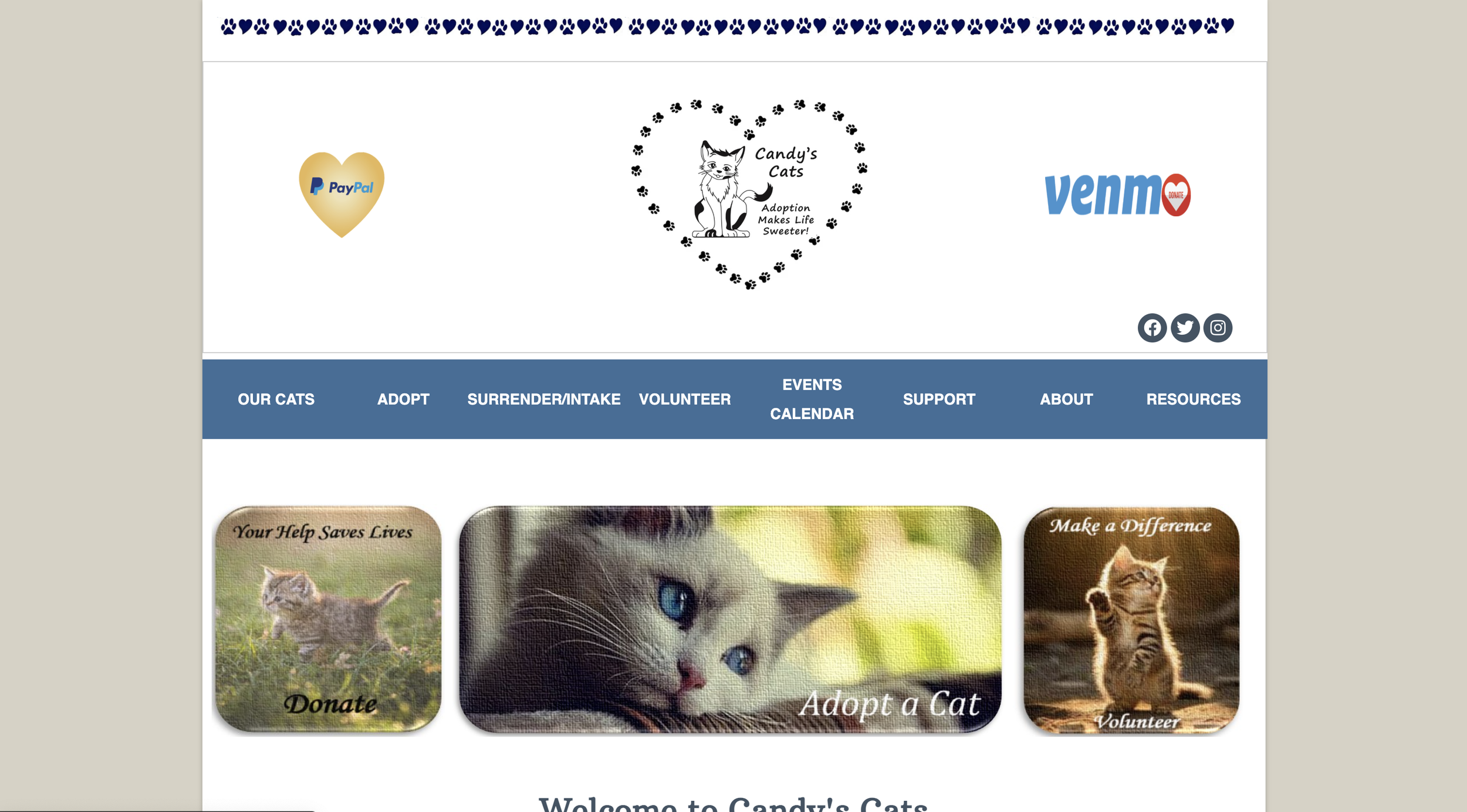
Users found that the current website of Candy's Cats lacked "character" and the website has a "cold" tone to it with no exact color palette or branding.
My team and I decided to implement a multitude of changes to help bring life to the redesign. These changes consisted of:
Including a set color platte consisting of "Burnt Orange, Olive, Beige, Eggplant, and Orange.
A warm, playful, friendly, and upbeat feel.
Vibrant imagery to showcase the cats at the shelter.

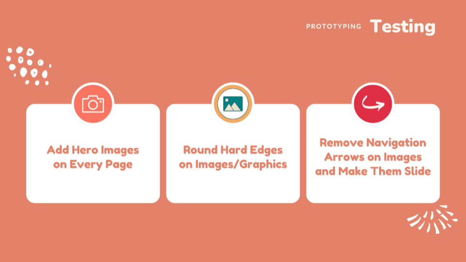
Prototyping
Mid - Fi Prototype Desktop Ver. (Homepage)
User Testing Feedback
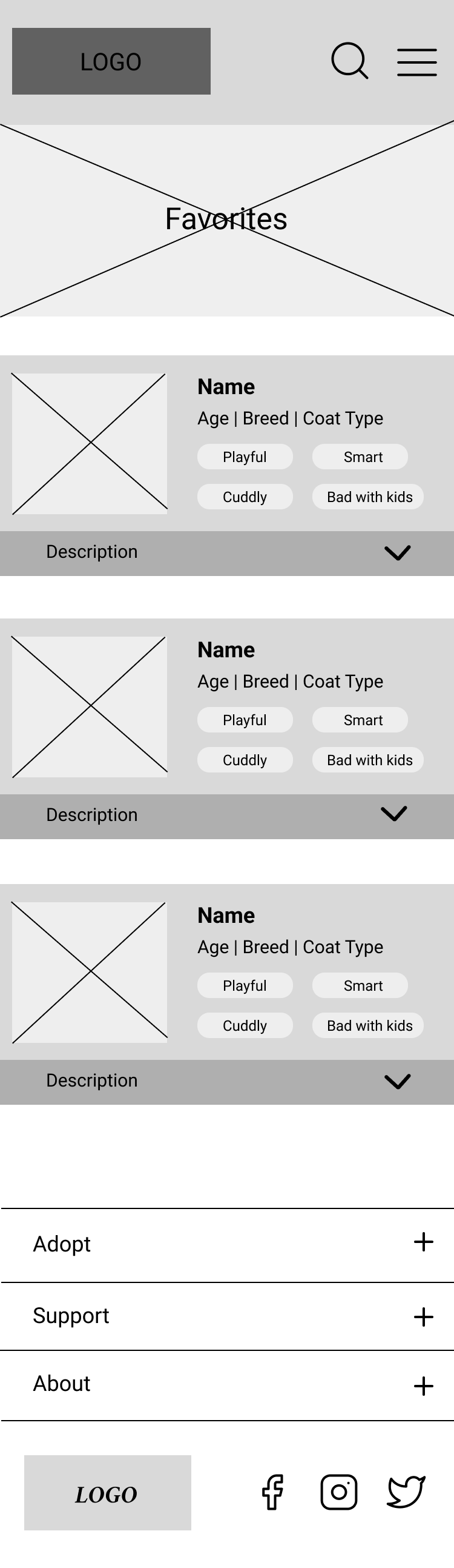
Mid - Fi Prototype Mobile Ver. (Favorites Page)
Desktop Ver.
Hi - Fidelity Prototype
Mobile Ver.

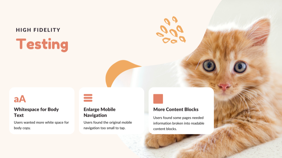
Hi-Fi Testing Results
Conclusion
From this redesign project, our team learned how organization and communication were imperative to effectively redesign the website as a group. Agreeing to hold our designs loosely and accept all constructive feedback made iterating an easy, positive experience. We also learned the value of a UI Style Guide and components as this greatly helped streamline our design.
We'd love to continue our website redesign by building more pages, creating a user profile that stores the user's cat vaccination records and vet visits, and creating the functionality where users can be alerted every time a new cat needs to be adopted.