FCC - Redesign Project
Project Description: A responsive web redesign for a government agency.
Team Members: Billy Ridore
Tools Used: InVision, Miro, and Figma.
Project Overview
The Problem: The FCC is an independent agency of the United States federal government that regulates communications by radio, television, wire, satellite, and cable across the United States. The FCC maintains jurisdiction over the areas of broadband access, fair competition, radio frequency use, media responsibility, public safety, and homeland security. The FCC's Website hosts a plethora of information regarding the rules and regulations of all things in the communications space; however the website as it currently stands it is often difficult for users to navigate and locate specific information they may need.
The Solution: The goal of this project is to identify Usability and Navigational issues in the pursuit of creating a new IA for the FCC and simplifying the look and feel of this government agency website.
Research
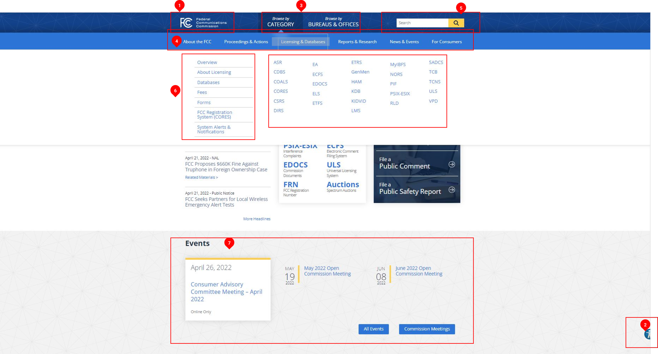
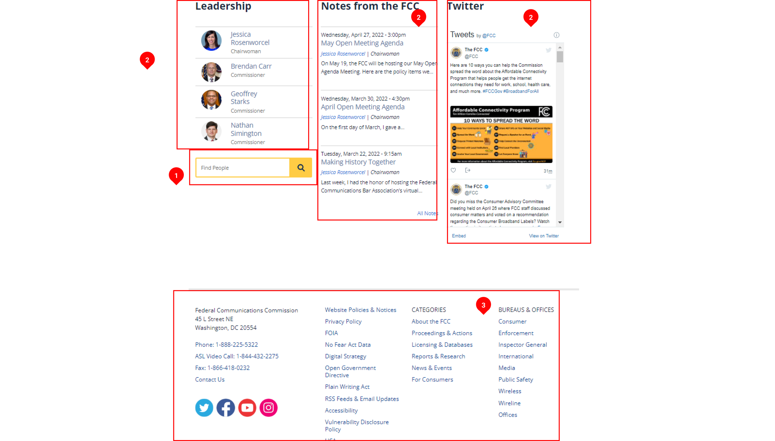
I began my research by familiarizing myself with the FCC. I learned about its purpose, it's function, and what exactly the website entails. Now that I was up to date with the FCC's functions; I analyzed the FCC's homepage and began a heuristic evaluation. I redlined the current homepage to identify each section and its functions.
Key Findings
Many Changes have been identified and could be made to the FCC website.
From the homepage, I have identified a few changes to be I would make.
From first glance the website appears busy and full of information.
Simplifying a few categories and a consolidation of information would greatly benefit the overall feel and look of the website.
Usability Tests - Navigation
Following the heuristic evaluation and redlining; I conducted usability tests with several participants to observe how users would navigate the homepage of the FCC.
Users: The ages of the users varied from ages 17 - 40. From students to professionals.
I tasked the users with filing a consumer complaint, file a public comment, and find the television station search.
Key Findings:
It took users a quite a bit of time to find where to file a complaint. Users had to use alternative search methods to get to the File a Complaint page.
The titles of certain categories gave users much confusion at a quick glance.
Overall, majority of users expressed that they found the homepage of the FCC and subsequent pages to be busy with an overload of information
Card Sorting
Following the navigation tests, I had the participants cart sort the current categories and sub categories of the FFC's homepage
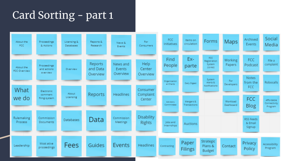
As referenced by the image above, users were overwhelmed by the multitude of categories. The participants then worked together in tandem to reorganize the current categories into new categories.
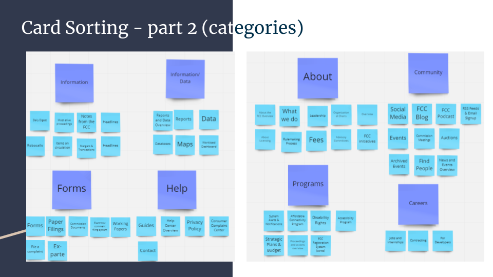
From the different categories and subcategories provided, the participants managed to consolidate the information into 8 categories with a varying amount of subcategories underneath. Participants grouped together categories based on similarities in title and contents of the pages.
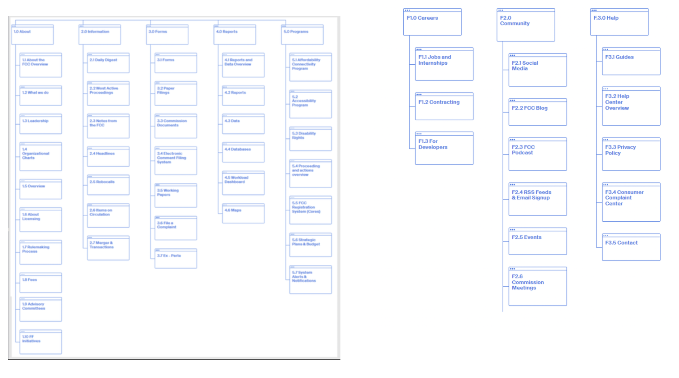
Site Mapping
Navigation bar site map
- The new categories listed are "About, Information, Forms, Reports, and Programs". Testers found those 5 categories to be the most essential and concise from the information provided on the current FCC website
Footer site map
- The footer was simplified into 3 categories "Careers, Community, and Help".
Lo-Fidelity Wireframe
Design Inspiration
For the low fidelity version of this redesign, I decided to keep the format of the upper top part of the navigation. Users found the search bar to be extremely useful.
For the format of the navigation bar, I included the new categories that users determined.
I formatted the contents of the homepage in a fashion similar to the existing website design, but attempting to declutter some of the information that is already on the homepage.
Lo-Fi User Test Key Findings
There were 7 participants in this user test of the lo-fi prototype. The goal of this test was to obtain user feedback on new navigation bar and layout of the home page.
Users provided much positive feedback towards the dropdown menu of the navigation bar.
However; users still felt that the homepage came across as "busy".
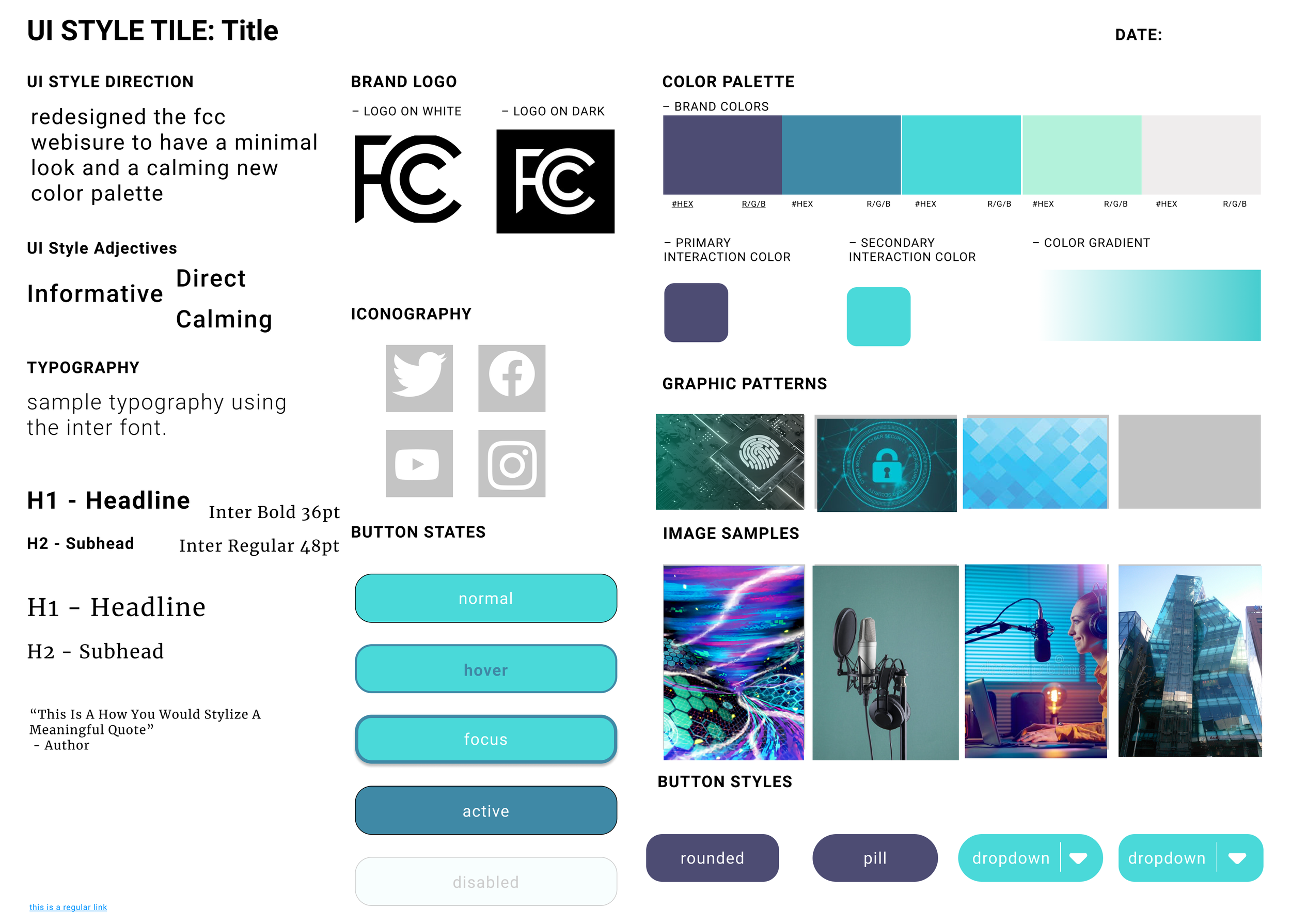
For the redesign of the FCC website; I decided to go with a minimal and clean aesthetic.
The original color palette of the FCC's website consisted of varying Blues leaning closer to a darker tone along side Yellows.
For the inspiration I looked towards images relating to communications, cyber technology, and digital graphics.
Ultimately I decided to go with a color palette of varying blues to emphasize a calming tone to counter the previous overwhelming and busy tone .
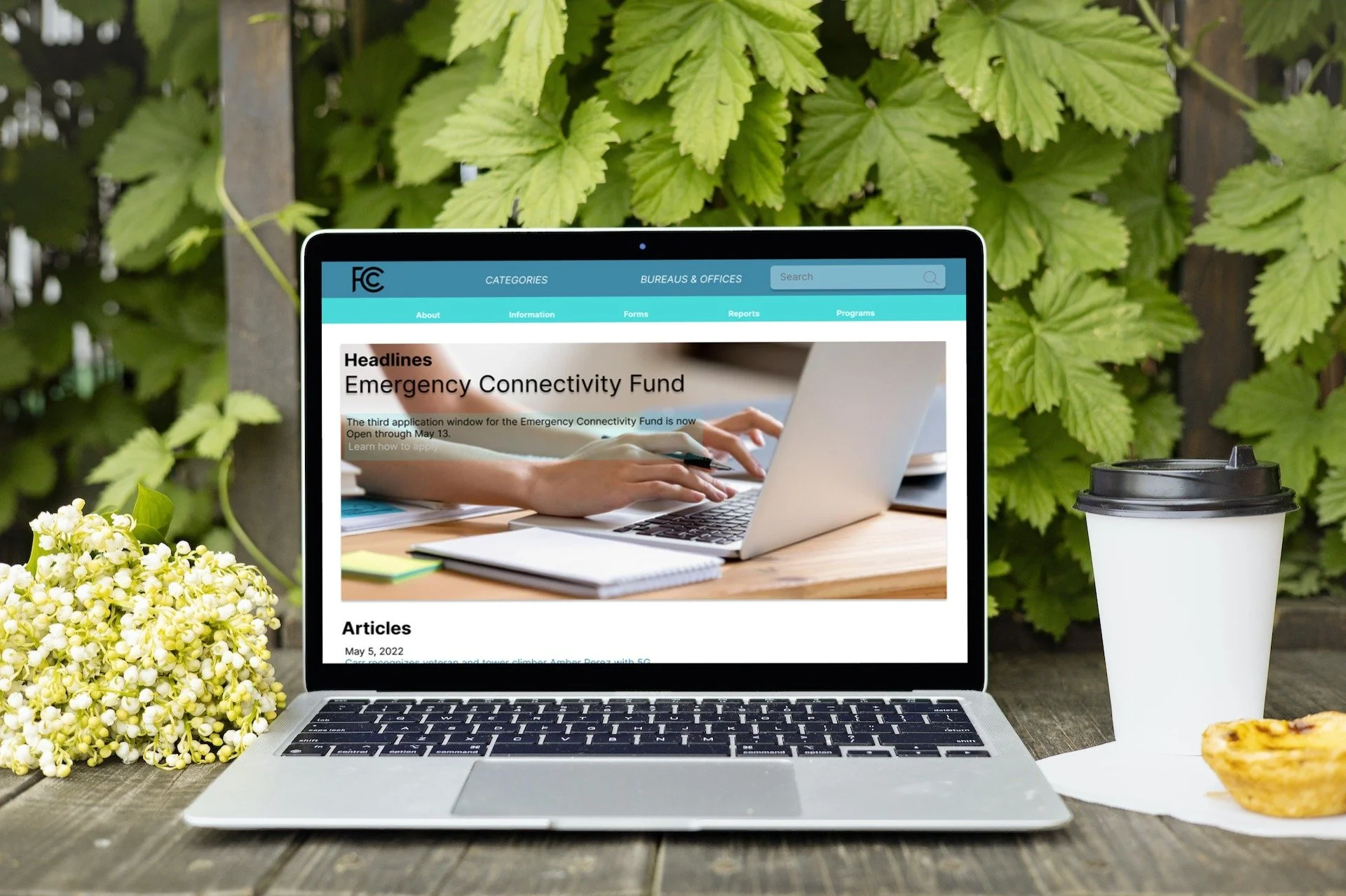
FCC Homepage Redesign
Desktop Ver.
Conclusion
Mobile Ver.
Usability Test
Final Design Verdict:
There was a redesign of the header and Navigation Bar.
Consolidated lengthy category titles of the original FCC website into a single encapsulating word.
Applied a calming new color palette.
4 participants were selected to navigate the current homepage and provide their thoughts and insights on this redesign.
Feedback:
”It looks nice and sleek. I like how the tabs appear very organized.”
“I love how the headline stands out, I would love to see rotating articles.”
“The colors are very good, I'm a sucker for blues and the tones from this website is very nice.”
“The options from the drop down menu look very good and it works seamlessly.”
“The mobile variant looks just like the desktop variant. It's minimal, and straight to the point.”
To conclude, I believe I accomplished my goal of redesigning the FCC homepage into a less busy, easy to navigate, and aesthetically pleasing design. I enjoyed working on this website because I challenged myself in taking a some what "plain" website that isn't accessed by the everyday user on a daily basis, and transformed it into something that the average user likes.
In total I completed this redesign within the span on 2 weeks. From gathering research material, conducting user tests, and designing and reiterating the prototypes. With more time, I would continue to improve on the navigation bar of both the Desktop ver. and Mobile ver. Given more time I would also love to expand on a couple more pages to create a new experience for users and obtain more feedback